")
")
Dalle Campane di Vetro alle Stanze Ovattate…Ecco l’atteso Riscatto dell’Opaco!
...Here is the expected Redemption of the Opaque!
Che sia semplice Pittura o i più innovativi Sistemi Decorativi Murali, oggi stiamo assistendo a una netta preferenza delle finiture Opache “piuttosto che” quelle Lucide. L’esplosione della Domanda di tinte ed effetti opachi apre il dibattito sul nuovo modo di arredare le pareti. Perchè questo cambio di tendenza? Perchè il la finitura Lucida sta diventando molto meno apprezzata rispetto all’Opaco? Rispondere a questi quesiti, può sembrare banale ma non lo è affatto, perchè entra in gioco il parere soggettivo sulla preferenza delle diverse finiture, ma cercheremo di dare la risoluzione Architettonicamente più adeguata.
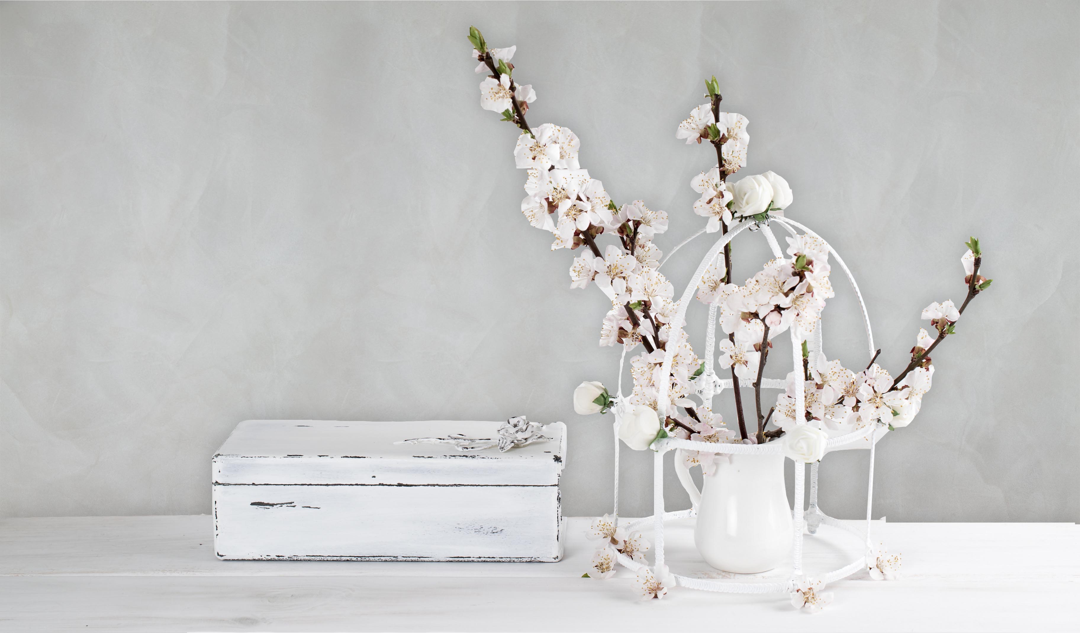
Gli anni 2000 hanno visto l’esplosione del Total White, dell’acciaio e del vetro come massima espressione della contemporaneità; ambienti asettici, freddi e inespressivi, quasi privi di decorazione hanno dettato le regole del Gioco dell’interior Design degli ultimi 20 anni. Ogni elemento decorativo era bandito poichè concettualmente la decorazione risiedeva nella “Lucentezza” dei materiali. Oggi invece assistiamo a un’inversione di tendenza che spinge sempre di più a dare un’identità all’abitazione dell’uomo, principio cardine in materia di decorazione, così come abbiamo ribadito più volte,…e allora perchè scegliere l’opaco? La finitura opaca, in ambito dei Sistemi decorativi ha la grande innovazione di “Definire” la percezione dei Volumi degli ambienti che si vivono, e si è scoperto che non è il Total White che esalta la purezza dei volumi, ma il suo comportamento con la Luce, quindi se è opaco il volume risulta ugualmente Puro anche se decorato…Ecco la Nascita dell’Effetto decorativo Opaco Contemporaneo!
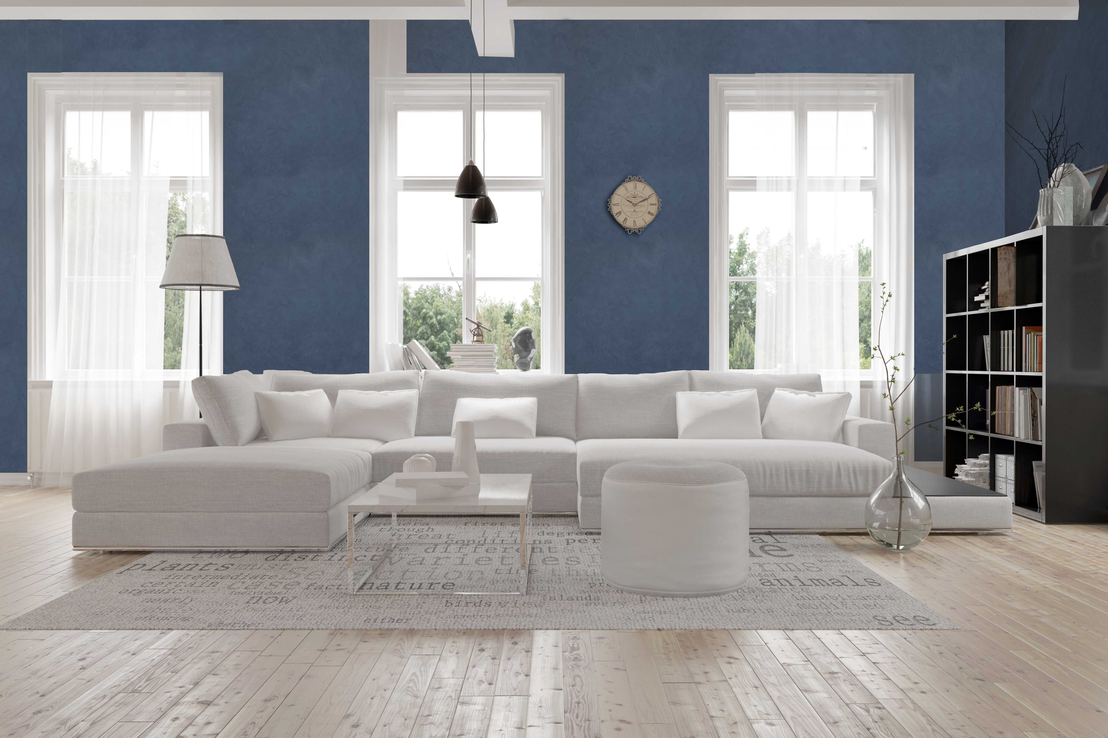
Qui entra in Gioco l’abilità dei maestri decoratori che propongono le soluzioni innovative di eccelsa qualità Stilistica che soddifano appieno la frenata sete di Opaco. Feel by Spiver rappresenta ad esempio l’antagonista del decorativo lucido per eccellenza, la sua spettacolare opacità e la percezione tattile della pittura riescono a “Ovattare” le superfici rendedole Pure e Semplici, esaltandosi nelle sfumature del bianco ma proponendo anche tonalità cromatiche che per molti anni sono scomparse dalle superfici murarie contemporanee. Quindi Feel Oltre la componente opaca possiede quell’elemento materico, morbido, setoso e Ovattato che estende la percezione visiva a quella tattile.
English Version
Whether it's a simple painting or the most innovative wall murals, we are now seeing a clear preference for opaque finishes rather than the shiny ones. The hughe request for opaque dyes and effects opens the debate on the new way of decorating walls. Why is there this change in trend ? Why are shiny finishes becoming much less appreciated rather than Opacque ? Answering these questions may seem trivial but not it is not , because the subjective opinion comes to the preference of the different finishes, but we will try to give the Architecturally more appropriate resolution. The years 2000 we saw the explosion of total white, steel and glass as the highest expression of contemporaryity; Aseptic, cold and inexpressive, almost without decorative environments have decided the rules of Interior Design over the last 20 years. Every decorative element was banned as conceptually the decoration was in the " Shineyness" of the material used. Today, on the other hand, we are witnessing a reversal of t5he trend which pushes us more and more to give an identity homes, a key principle in decoration, as we have mentioned ... so why choose opaque? Matt finish, in decorative systems, has great innovation in "Defining" the perception of volume in living environments, and it has been discovered that total white is not the purity of volume but its contrast with Light, so if it is opaque the volume is equally seen even if decorated ... This is the New arrival of Contemporary Opaque Decorative Effect! This is where the ability of decorating masters who propose the innovative high-end style solutions that fully satisfy endless desire for Opaque. Feel by Spiver is, for example, an antagonist of top class shiney decorative, its spectacular opacity and tactile perception of painting is able to "grab" pure and simple rendered surfaces, exalting in shades of white but also offering color tones which for many years have disappeared from contemporary wall surfaces. So Feel other than the matte component contains the material element , soft, silky and soft which extends visual perception to that tactile.
Comments
-
This is exceptionally inspirational and an extremely motivating material for every one of us. I am happy that I have seen this post. The things that were recognizing by our works will surely help us to accomplish more awards throughout our life in the future. You can use this best essay for any kind of academic writing work.
-
In the meantime it was inescapable that in the work of compiling the vocabulary some extra events for making notes were found, and new light was acquired on a few places where notes as of now stood. The outcome is that the notes in the present impression, however shorter than some time recently, contain more information <a href="/http://www.essayempire.co.uk/essay-editing-service/">Essay Editing and Proofreading</a>.
-
Very beautiful post and i am so glad to find this blog because it took me to [URL=https://www.theacademicpapers.co.uk/buy-essays-online-uk.php]Buy Essays Online[/URL] for soving my broblem in study
-
-
-
-
-
xl extra large משחה גודל הפין לפי גיל, תמונות של איבר גברי, איך מגדילים את הזין. זקפה איך להגדיל את האיבר, איבר המין הגברי, הפין הגברי. זקפה איך להגדיל את האיבר, איבר המין הגברי, הפין הגברי.
-
היקף הפין איך להתחיל עם בחורה, איך להתחיל עם בחורה, אקסטרה סייז. הפין גודל הפין, איך מגדילים את הזין, מה גודל הפין הממוצע. הפין גודל הפין, איך מגדילים את הזין, מה גודל הפין הממוצע.


Leave your comments